Nicknamed "The New York of Canada," Toronto is a fascinating place with so much to see and do (hey, Drake). Visiting Toronto is one thing, but actually living there is another. A friend of mine has a daughter headed off to the University of Toronto and she asked if I would join in looking for a place where her daughter could live while she was attending University.
Duh! Do the most and use data.
Of course I would never turn down an opportunity to visit Toronto, plus I've been meaning to check out that shoe museum. I was in!
As a serial organizer and planner, I began mapping out our trip. Then, it dawned on me... why not do this the data way?
I decided I would score the neighborhoods of Toronto based on:
Affordability
Commute
Education
Health
Own to Rent
Ratio
Safety
Walk Score
Unemployment Rate
I also wanted to know what kinds of venues are in each neighborhood, population changes, housing prices, where to get good whiskey, where to find Drake. I wanted all the data.
Because I wanted to separate by neighborhood, I knew I needed location information. I also needed census information, venue types and locations, and all the lyrics from the Views album.
Part 1: Getting the Data
To gather the postal code information, I scraped a Wikipedia page using BeautifulSoup. Inspecting the html shows the information needed is found under tag 'table' and class 'wikitable sortable.'
Using the find method of bs4 object I extracted the data in table. Taking a look at the table, the data can be found under td tags of parent tags tr.
To extract this data:
1. Iterate over each of the tr tags to get the td tag.
2. Save the data to a csv file and convert it to a pandas DataFrame.
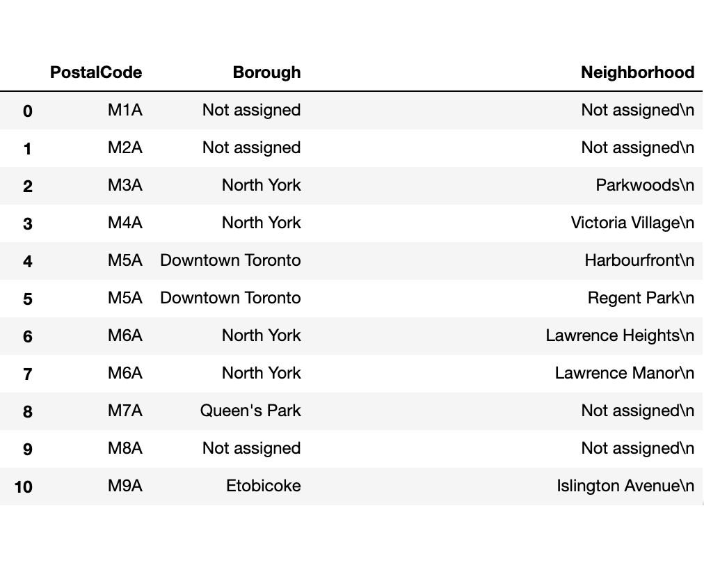
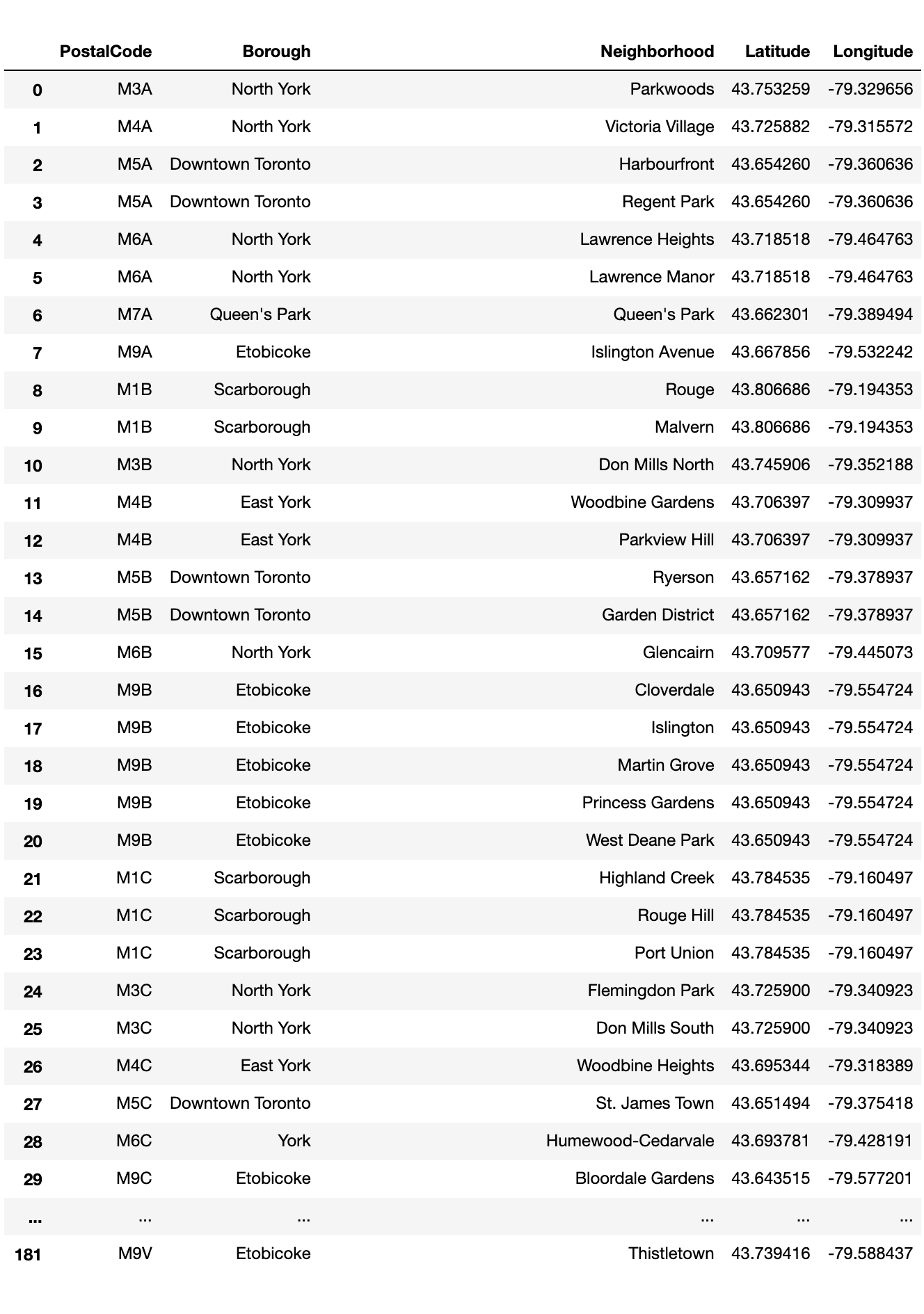
My original DataFrame had 288 rows, but a lot of them had "Not Assigned" for the Borough column. These entries were dropped. Those entries with "Not Assigned" in the Neighborhood column were updated with the Borough name. Additional cleaning to remove unwanted characters and I now have a DataFrame with 211 rows and 3 columns.
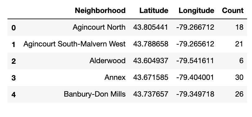
Next, I obtained the longitude and latitude coordinates for each postal code. The data was obtained from https://cocl.us/Geospatial_data. I was able to download it as a csv file, so all that was needed was to read the csv using pandas and merge the two tables.
With the tables merged, I now had a pretty DataFrame with location information for the neighborhoods.
Next, I would get information about venues, but before starting with Foursquare, I wanted to get an overall idea of the neighborhoods.
Using pandas' unique(), I know there are 11 boroughs. I am terrible with geography, so I decide to put this on a map so I can see it. I used Folium to create the map. I set a different color marker for each borough using a dictionary with the borough names and it's color. Then, I added the neighborhoods on top as a pop-up label.
Time for Foursquare. Using the Foursquare API, I was able to get venue information in each area. I also extracted the categories of the venues. Always good to know what kind of place LCBO is, right? (It's a liquor store).
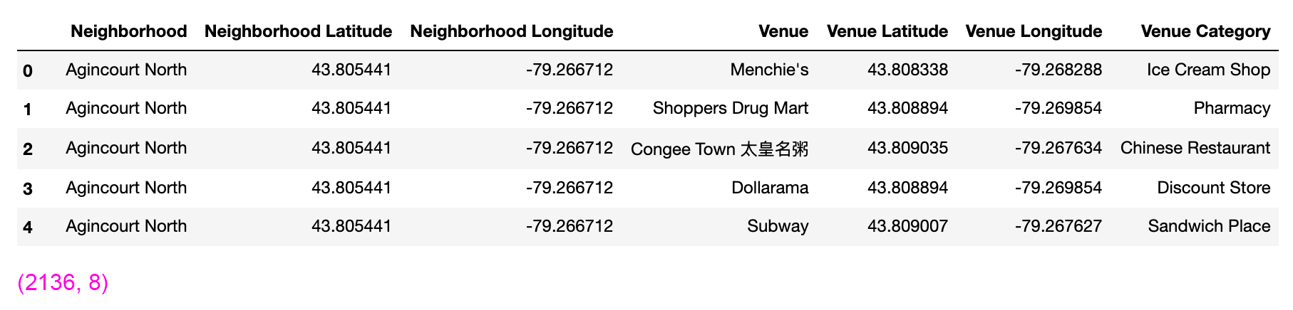
With venue information in hand, I checked the number of venues returned for each neighborhood using pandas' groupby() and count(), then put that in a new DataFrame.
Part 2: Initial Visualization
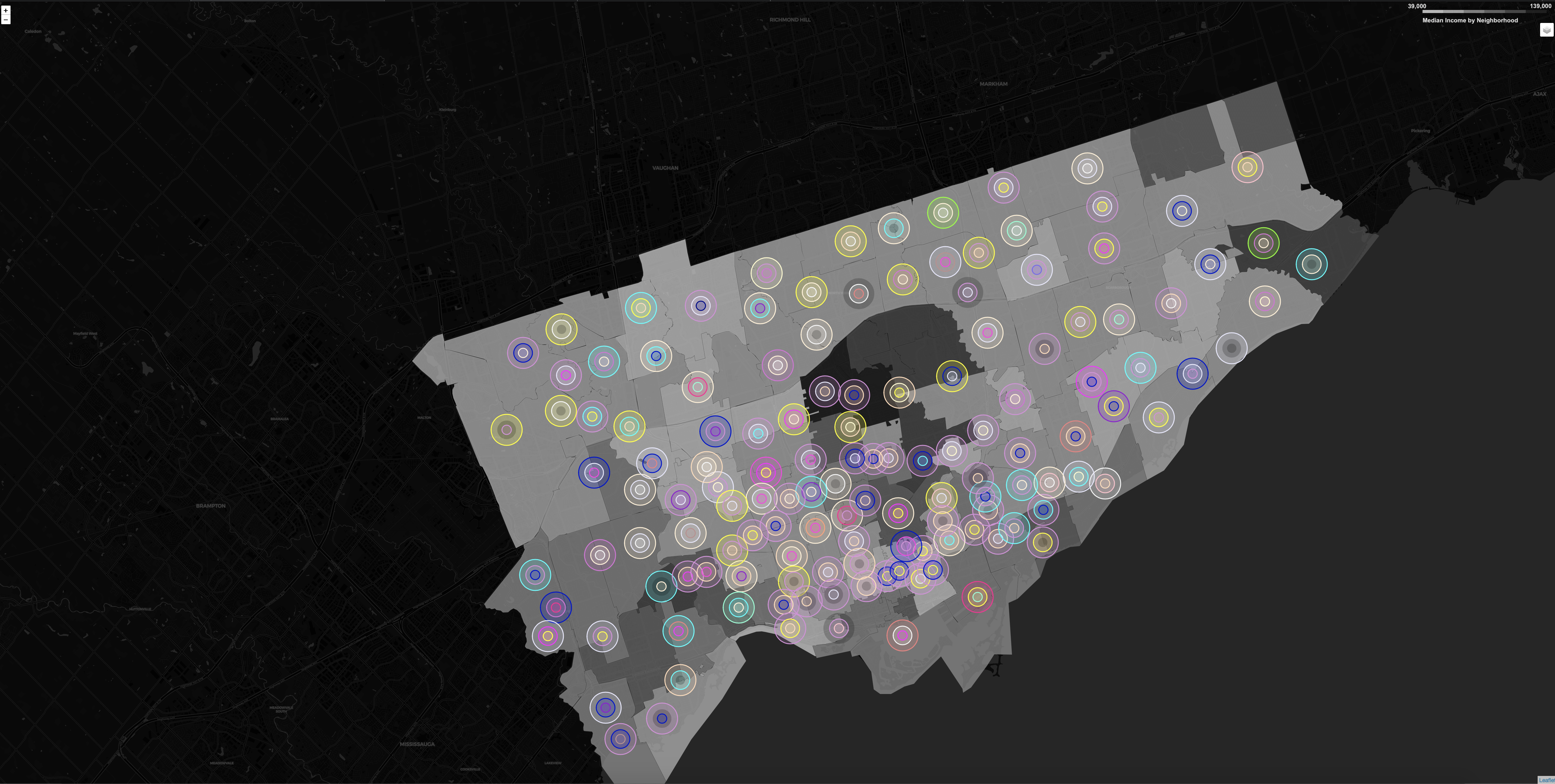
It would be interesting to know the venue density for each area. Of course, you can get an idea by going through the rows on the DataFrame, but I want to see the big picture, so... let's see that on a map.
Below are two variations of visualizing venue density using Folium. Folium is awesome and makes anyone who uses it a mapping genius. 🥇
Heatmap
The first is a heatmap layer on top of the base map. Heatmap does not take in DataFrames, rather data is a list. It is important to note NaNs and values other than floats will land you on the struggle bus.
Bubble Markers
The second is a Folium map with bubble markers. Each bubble has a size related to a specific value to illustrate density. The bubble markers are added on top as (.add_to) the map. A pop-up attribute is also included. The text for each neighborhood and the number of venues may be see by clicking on the marker.
Really cool add-ons in the future could include interactive markers which allow users to click anywhere on the map and add their own markers.
Part 3: Analyzing
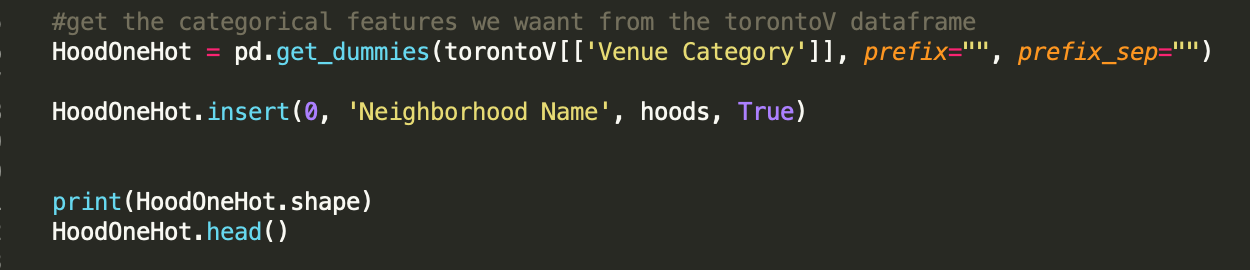
It's time to turn the strings into 1's and 0's to be used in the classification algorithm. One hot encoding can do this easily:
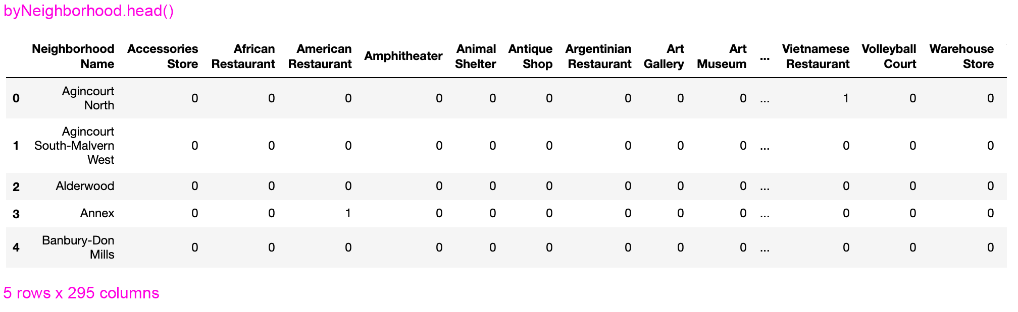
From here, some data manipulation is required: group by neighborhood, calculate mean and reset index. The result is a DataFrame like this:
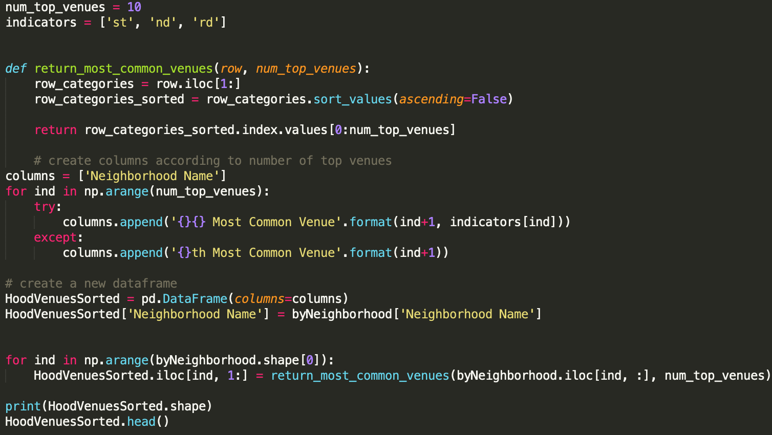
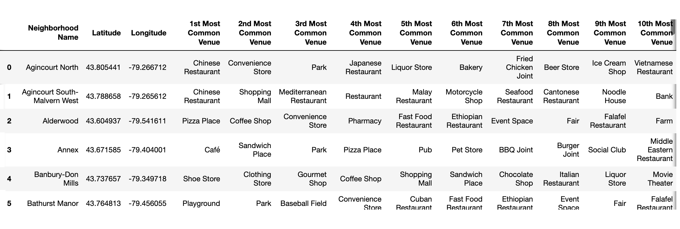
Taking a look at the top ten venue types for each neighborhood:
Using the information gathered so far, I decided to plot the top three venues for each neighborhood on a map. This give a quick glance at how the neighborhoods may be clustered.
I then used K-Means to cluster:
And checked I used the optimal number of clusters using the elbow method for optimal K.
**STILL IN PROGRESS...**
Additional cleaning, manipulating, visualization of data, initial visualization...see what is going on, maps, code snippet screenshot, photo of iniital observations
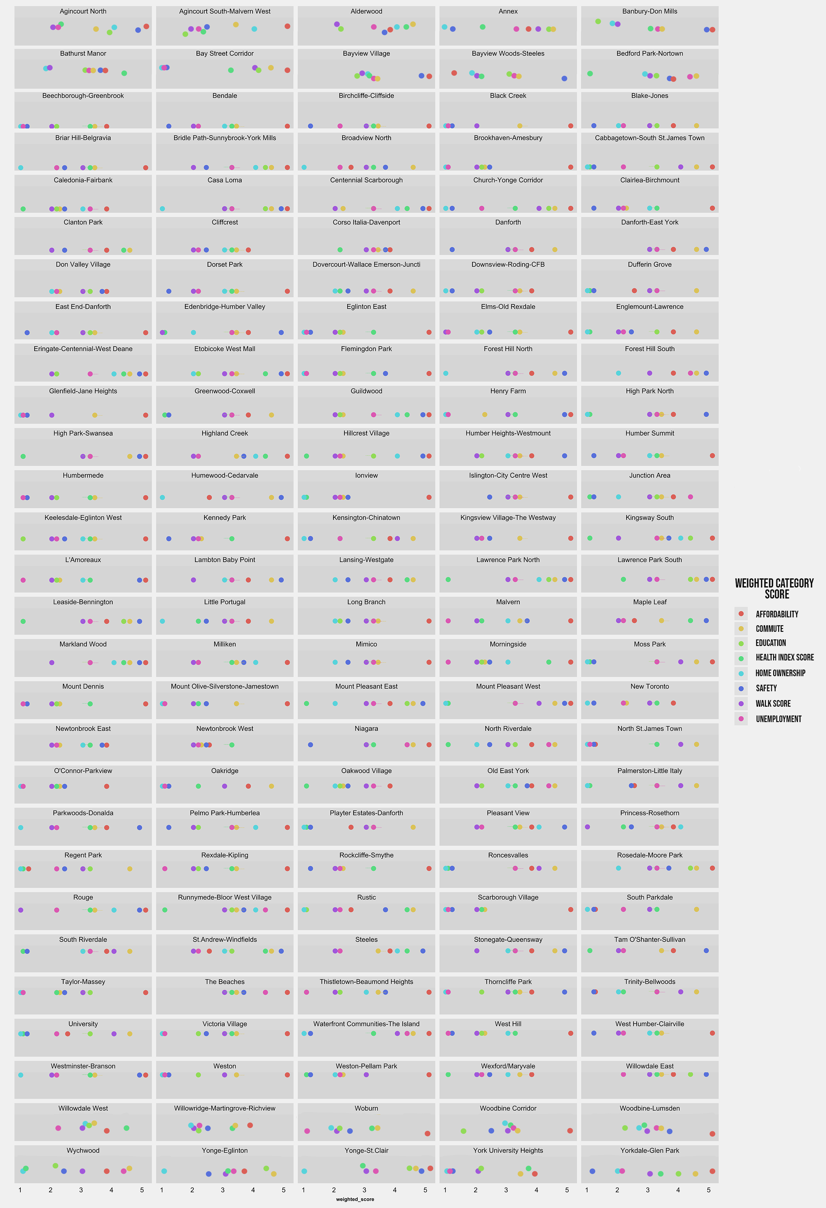
Additional steps, code snippets, DataFrame screenshots, Check out the interactive map here!
View Code


Leave a Reply